Maths · P6 · Specimen 03 Maths Questions
· 26 Jun 2026, 12:51
· asked by maxloo
· resolved
SP003 Maths Paper 1 Booklet A – Question 09
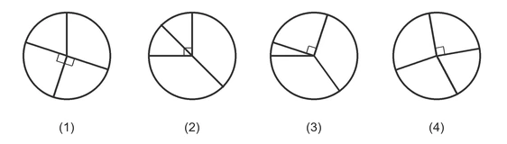
Some students were asked to choose their favourite colour.
25% of the students chose green and $\dfrac{1}{5}$ of them chose yellow.
An equal number of students chose blue or red.
Which of the following pie charts best represents the information?